Pro Mobile Blog #1: The Cover Image Challenge
This is the first entry in the Pro Mobile Blog series, and we want to dive straight into one of the most challenging problems we tackled recently: understanding and improving how a game’s cover image influences Click-Through Rate (CTR).
Why CTR is everything for casual games
In the world of games, especially casual games, CTR is everything. Your game cover image acts as the very first impression for the whole game. If it is poor, people won’t click and never see your game even if they would have liked it.
It’s simple: no matter how good your gameplay is, if no one clicks to play the game online or download it, no one will ever play it. A low CTR means the game is invisible.
I took on a mission to improve the CTR even by a little bit for our Clean game. It’s a casual online puzzle game where you match 3 colors on the grid to make tiles disappear. Quite relaxing and fun.
What “good” CTR looks like for casual games
To put things in perspective, here’s a quick look at standard CTR performance for casual games:
| Tier | CTR | Rough share of free online casual games |
|---|---|---|
| Strong | ~5% | About 20% of titles reach this band |
| Average | ~3% | About 60% sit near this level |
| Weak | Below 2% | About 20% end up in the bottom tier |
The painful starting point
For Clean, opening numbers were tough: CTR was around 1.1% - well under the “average” cluster and closer to the bottom tier.
While it was sad to look at these numbers, I was still positive. It should be quite easy to improve something that is this bad. Especially given that we live in the age of AI-powered design tools. It should not be difficult to create a new cover image that would put my game into the 60% average group. I was wrong. It appeared harder than I anticipated.
Data and timeline
Clean had already been live for about three months by the time this post was written, so we had a usable baseline and iteration history.
We tracked CTR from late February 2026 through early May 2026. The flat segment from launch through 22 April reflects performance on the initial cover (detailed below).
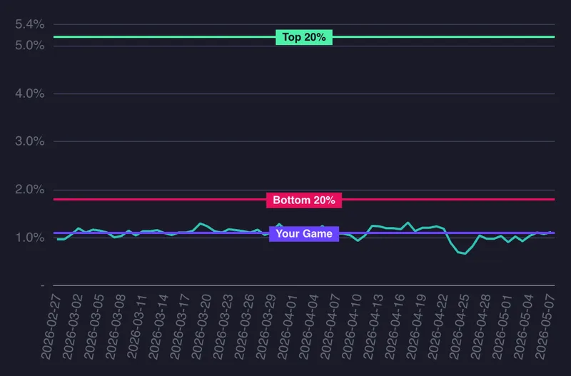
Initial cover (~1.1% CTR - stable baseline)
We wanted to highlight that the game is very simple and minimalistic. We showed the three colors used in the game, placing them next to each other to give a hint that the colors change. While it might not be perfectly clear we thought it intuitively communicated the idea.
![]()
The image’s consistent CTR was 1.1%. My target was to exceed the bottom 20% and achieve at least a 2% CTR. Because the current image was performing poorly, I decided a radical change was necessary.
Second attempt - borrowing from competition (~0.7% CTR)
Since I’m not a designer, I decided to look at other games and try to make the cover image more similar to theirs. I wanted to try something completely different from the previous image, so this was my second attempt.
![]()
The Click-Through Rate (CTR) for this one dropped to 0.7%. I quickly understood that I had taken the wrong direction.
Third attempt - reuse initial cover style but improved (~1.1% again)
I decided to keep the style of the previous image but work on it a bit more, hoping to move closer to a 2% CTR.
This is what I came up with:
![]()
With this change, I was able to get the game CTR back to 1.1%, which I already considered a success. But then I went back to square one. So I decided to keep the theme and think about how I could gradually improve the image.
Next test - same but richer
Here is my latest creation that I will try next week:
![]()
I kept the light background and rainbow font. I also decided to add different game levels so the player gets some insights into fun level shapes and different tile types, such as skulls. I don’t know how well it will perform next week, but I certainly hope to breach the 2% milestone. I will post updates about how it went in the next blog post.
Written by
Ana